Showing posts with label Marvel Comics. Show all posts

Wednesday, 28 May 2025

Marvel Studios' The Infinity Saga - Captain America: Civil War: The Art of the Movie - Book Review


'Picking up where the blockbuster hit Avengers: Age of Ultron left off, Captain America: Civil War sees Steve Rogers leading the new team of Avengers in their continued efforts to safeguard humanity. Filled with exclusive concept art, production stills, and commentary from cast and crew, this book is a prize for any fan.

'Here is everything you need to know about the making of the movie from all the key players—including returning directors Anthony and Joe Russo, and producer Kevin Feige, along with all the talented special-effects gurus, concept illustrators, visual-effects designers, and storyboard artists who worked on the set and behind the scenes to create the art of Captain America: Civil War.'

Civil War was a divisive event at Marvel Comics. It was a headline, universe spanning initiative that appeared in most of the books being published, and even derailed a lot of stories, changing the way characters interacted with the world and the projection of their planned stories. Add onto that, there were fans who felt that certain characters were handled poorly, or had their personalities and character changed to fit with the plot that they barely felt like who they were supposed to be. As such, when it was announced that the MCU would be doing their own version of the story there were many fans, myself included, who saw this as an attempt to right some of those wrongs, and to craft a much better version than the source material. 

The MCU benefitted from having a smaller world, and a smaller pool of characters to draw from, and as such were able to create a much tighter story. It also helped that they pushed the Registration Act/the Sokovia Accords to the side and made a more personal story the key reason for its two leads, Captain America and Iron-Man, come into conflict. Titan Book's latest entry in the Marvel Studio's Infinity Saga art book series goes into the making of the movie, showing readers how this iconic story was adapted to the big screen. 

As with previous releases, this one breaks things down into nicely sized chapters that take readers through the film in chronological order after a brief introduction that discusses the comic inspiration for the film. The first chapter is 'Showdown in Lagos' and deals with the opening sequence of the film, as well as some costume changes for some of our returning heroes. Beginning with the titular hero, we get some designs for the new Captain America costume, alongside an abandoned concept of a more undercover look that honestly fits the secret agent vibe that Cap has at times that would have been pretty cool to see on the screen.

This chapter also shows off the new looks for the other new Avengers members teased at the end of Avengers: Age of Ultron, giving us new looks for Falcon that want to try to be as realistic as possible but also convey some of his comic book roots, and the small tweaks to Black Widow, whose design had mostly been fairly unchanging since her introduction in Ironman 2. The character who seems to have gone through the most design changes since their last appearance, however, is Scarlet Witch, whose new costume as seen at the end of Avengers: Age of Ultron gets abandoned for a more realistic outfit. It's a shame to hear that the Russo brothers wanted to scale back her look and make it more 'grounded' as out of the returning cast she seems to be the one who lost out the most; and even the few rejected designs here that feature her headband look much better than what we got on screen.


©2025 MARVEL


We also get several pages dedicated to the Crossbones, the new villainous identity for a supporting character from the previous Captain America film. It's interesting to see how the film toyed with giving him a more grounded design, with the white cross that's painted on his chest almost being made with straps and suit components. I like that the film went with the look they did, as it's the much better design, though some of the helmets in the concept art push the skull motif more than what we ended up with, and had a much creepier result. The chapter rounds out with several pages of concept art for the fight that happens in Laos, designs for the lab equipment, and the tragic final moments.

The second chapter is 'The Sokovia Accords', and deals with some of the more mundane designs in the book, focusing on the Avengers compound. Despite being home to a group of fantastical people, their facility is fairly normal, and we get artwork showing us the look of their conference room, offices, and kitchen. There's a two page spread that shows some costume designs for Vision's civilian attire that remind you that it's about super heroes, but for the most part it's one of the most grounded chapters in the book, and whilst interesting will likely be the section most people revisit the least.

Much more interesting in comparison is chapter three, 'Cat and Mouse', which deals with two of the more important supporting characters, Bucky Barnes, and the newly introduced Black Panther. Both of them get several pages given over to their new designs, with the main focus on Bucky being his civilian attire, making sure that he's able to blend in, but able to quickly stand out with the removal of his left sleeve. It's interesting to see how much work actually goes into making 'man with a metal arm' works, as there's definitely a few ways of doing that that end up looking a bit less serious than it should. There's much more attention given over to the look of Black Panther, who was newly added to the MCU with this film, I was hoping that we'd get more designs for him, perhaps ones that showed off some of his more unusual looks from the comics, but it seems that the film had a pretty clear idea of the kind of look they wanted for him, and focused instead on how to make his suit feel real, rather than the look of the suit itself.

Most of the third chapter is given over to the extensive chase sequence that takes place in this part of the film, going from an apartment building to rooftops, and then to a vehicle chase. The sequence gets broken down into a lot of detail here, and the book shows off a number of storyboards that showcase how each moment has to be carefully planned out and crafted, even down to the angle of the shot. Whilst interesting in its own right, when read in conjunction with watching the scene it becomes a lot more interesting as you're able to see just how the art was translated onto the screen, able to follow the moments along and comparing the two pieces.

The fourth chapter, 'Mind Games', is similar to the second in that it deals more with environmental design, this time covering the facility where a captured Bucky and Captain America are taken to following their daring escape attempt. More interesting than the Avengers compound, this chapter at least goes into more detail as it shows off designs for the cell that holds Bucky, the machines used to try to subdue his enhanced body, and a storyboard of Hawkeye fighting Vision to break Scarlet Witch out of custody which was much bigger and more intricate in the initial plans.

The fifth chapter is probably the one most people reading the book will be eager to get to, 'Civil War'. The chapter opens by rounding out the character designs for those who've not yet had it, including Ant-Man and Hawkeye. Little gets changed for most of the characters, though there are a few designs for Hawkeye that draw more heavily from his Ultimates look that feel a bit like a misstep, so I'm glad we didn't end up going that route. After these character pages, we get a couple dozen pages of gorgeous two page spreads showcasing various artists concepts for the airport fight.


©2025 MARVEL


It's interesting to see these segments as they show off that early stages of the script hadn't finalised which size heroes would be on, so there are some match-up's here that never make it to the final movie, such as Ant-Man fighting Hawkeye, Captain America fighting Ant-Man, and Vision fighting Ironman. Whilst the content of the images don't always line up with the final movie the feel of them certainly does, and it feels like the art team were having a lot of fun coming up with concepts for the iconic battle. This is also the only chapter to feature any art of Spider-Man, with him appearing on about five images fighting other characters. I understand that there are certain rights issues surrounding the character that likely lead to him only being able to be used sparingly here, but it's a shame that we didn't get better looks at costume designs as we did the others. 

Chapter six, 'Original Sins', takes us to the final stages of the film, and includes designs for the super soldier facility, as well as the clearest looks at the group of super soldiers that we have; certainly more than we see in the final film. It's nice to see more details like this, as this part of the film felt a little light on details when it actually came to watching it, so seeing how the place worked and what the super soldiers were like here certainly feels like it fills in a number of gaps for me. The latter half of the chapter focuses on the fight between Cap, Bucky, and Ironman, and much like the airport fight art, seems to be concerned more with finding the right kind of tone and style for the scene, rather than necessarily trying to depict moments that would end up in the final product. 

The final chapter deals with the marketing for the film, and there are some interesting looks at how the artwork for the films advertisement gets broken down and crafted stage by stage.

As with other releases in the series there are things that I really loved about this book, such as seeing the various costume designs, and artwork that shows us the way the team tried to craft a tone rather than detail. However, there are moments that are a little less exciting to read, such as seeing how the Avengers kitchen were designed. I've notices with this series that the titles that deal with the more grounded movies will have these ups and downs as they have to convey both the normality of this universe, as well as the fantastical qualities; and whilst this might not be to everyone's tastes it certainly doesn't detract from the overall quality of the book.

For those who are collecting this series this marks a fantastic addition to the collection, and for those who haven't picked one of these books up before but are tempted by this one I think that there's certainly enough here to grab your attention and make you interested in reading more.


Support Amy on Patreon

Buy Amy A Coffee

Go to Amy's Blog

Thursday, 8 May 2025

Ultimate Wolverine #5 - Comic Review


Writer: Chris Condon, Artist: Alex Lins, 
Colourist: Bryan Valenza, Letterer: Cory Petit

Ultimate Wolverine was one of those books I was a little unsure about when it was first announced. The Ultimate X-Men book was great, even if I think it works better in a single read than month to month, and is its own unique animal that feels very unconnected in story and tone to the rest of the Ultimate universe. As such, I was unsure how this book was going to fit in with that. Whilst this title has done more to help push Ultimate X-Men even more into feeling like its own thing it's absolutely blown my expectations away, and has become my favourite title in the line so far.

The first four issues have spent a lot of time setting up Logan, and showing us how the Eurasian Republic rules with an iron fist, using awful techniques to put down any opponent. Logan, a former member of the resistance group The Opposition, is one of those methods, having been captured, experimented on, and physically and psychically broken and rebuilt into the Winter Solider, their ultimate weapon.

This issue moves away from Logan somewhat, and makes him more of a supporting character as we focus instead on Victor Creed, the man we know as Sabretooth. The cover, along with our experiences with the character in the main universe, build a certain expectation for this version of the character, and those expecting a vicious monster on par with the creature that Logan has been made into might be getting something of a surprise. 

Opening in the city of Rasputingrad, we find Creed running a small bar. But he's not just there to enjoy the quiet life, as it seems that Sabretooth is a part of The Opposition and their underground railroad, smuggling young mutants out of the country and the tyrannical rule of the Rasputins. With two children, Leech and Artie Maddicks, literally living under his floorboards whilst they wait to be taken to safety, this issue evokes some strong images from history, and instantly showcases how this version of Victor Creed is a very different animal.


I love this shift in the character. One of my favourite versions of Sabretooth was the Age of Apocalypse version, who I mostly knew from Exiles. His relationship with Blink was great, and I loved him being a caring father figure. It's also a wonderful inverse of the roles he and Logan have in the 616 universe, where he's the monstrous killer and Logan cares for mutant kids. I was also surprised how quickly a few pages of him being kind and caring towards a couple of kids made me really care about him, and genuinely fear for his safety once Logan arrived on the scene.

This issue Logan is a bogeyman, a monster that arrives in the middle of the night to threaten decent people and take children away in the dark. It hammers home how frightening a figure he is in this universe, and the fight that takes place between him and Creed is bloody, brutal, and fantastically depicted by the art team.

Speaking of the art, this issue sees a change in the artists, with Alex Lins taking over for Alessandro Cappuccio. It's a very different feel for the book, though one that works well in this setting. I absolutely adored Cappuccio's work on the previous four issues, and he created some absolutely gorgeous environments, depicting the brutal beauty of the Russian landscape. Lins, in contrast, creates art that seems to focus on the characters more, with the panels often having little to no background art in them, drawing the focus to Creed, the kids, and eventually Logan too. It helps to make the story happening this issue feel more grounded, a more human story, and whilst the awful beauty of the violence has a different flavour to it than previous issues it's no less brutal and shocking.

This issue ends up adding a lot more background information, and begins to fill in more of the blanks we have for Logan and his past, even if he's not learning about them himself. We also get another familiar face introduced that we'll likely be seeing more of next issue.

For those who've been enjoying this series I'm hoping that you love this issue as much as I do. It's a wonderful change of pace that doesn't feel shocking or out of place, and adds to this interesting tapestry that Condon is crafting. And if things continue as they have this issue the 6160 version of Victor Creed might become one of my favourites.


Support Amy on Patreon

Buy Amy A Coffee

Go to Amy's Blog

Tuesday, 25 March 2025

Marvel Studios' Infinity Saga - Ant-Man: The Art of the Movie - Book Review


For comic book fans there was a slight mistake when the first Avengers movie hit the screens, the founding members weren't quite right. Yes, the film included the Hulk, who is often forgotten as an original member, and they made the main villain Loki, but they forgot three fifths of the original team, Ant-Man and the Wasp. It wasn't until after the second Avengers film, Avengers: Age of Ultron, that moviegoers would get to see these classic heroes on the big screen after something of a tumultuous production.

Marvel Studios' Infinity Saga - Ant-Man: The Art of the Movie takes a look at some of the behind the scenes of the making of a film that was considered something of a big risk for the studio, as their smallest character prepared to take the world by storm. Ant-Man is a character with a very complex, and sometimes unsavoury, history in the comics, and the book opens with a brief introduction to Hank Pym and the others to wear the helmet. It's pretty brief, as if the book covered the history of Ant-Man in any real depth the book would have to be a lot bigger, but it provides readers with a decent grounding if their only experience with the character is the movies.

The first chapter covers Ant-Man himself and the designs for the suit. As with previous books in the series the suit designs are some of the best stuff, and it's interesting to see the process the team went through to get the perfect look. A lot of the suits seem to be going along the same design path, sticking pretty close to what we ended up with, but after looking through what's on display here it really does feel like the movie got the design just right, as most of the ones in the book just feel a little bit off. This is especially obvious when it comes to the helmet designs, and there are several where the team tried a more insect-like look, which sounds like it should work, but it ends up making the character a bit too alien and unsettling at times.


©2025 MARVEL


After this chapter the book spends a great deal of time going over the design process for one of the most important aspects of Ant-Man, shrinking. The book showcases just how much thought and planning had to go into these sequences, and we're treated to a lot of storyboards as well as concept art that illustrates how each and every step had to be carefully laid out and considered. It highlights how important getting this aspect of the film right was, as if it hadn't have been handled so well it's easy for these kind of effects to veer into the schlocky. 

One of the biggest departures from the comics that the film made was making Yellowjacket into a different character, rather than one of the identities that Ant-Man would take on. This worked to the films benefit, as it was a character that came with a connection to the protagonists, but allowed the studio the freedom to make something new. The chapter that covers the villain has some of the best designs in the book, and some of the rejected Yellowjacket looks end up being my favourite versions of the character. There are several that go a bit too insect-like, that make the suit very sinister, and I love them. The villain is the character where veering too far into the inhuman works, and there's more than one design in here that I wished we could have had on the big screen. 

One of the biggest sections of the book is given over to the smallest characters, the ants. Something that I love about the first Ant-Man that I feel was a little lacking in his other film appearances was how much he used ants in his missions. The film included several different species of ants, who would have various tasks, and whilst it was a fun inclusion the film didn't always give you much time to really take in Scott's tiny allies. The book spends a lot of time showcasing the ants and all of the equipment they get to play with. There are various designs for the saddles they wear, as well as winches, cameras, fuel tanks, lasers, solar panels, and more. It's genuinely delightful to see all of the tiny devices strapped to the ants and it makes you appreciate how much work goes into making a concept like an ant with a radar dish on its back feel like something that could actually happen.


©2025 MARVEL


There are a couple of pages towards the back of the book for the Wasp, a character who only appears briefly in the film via flashbacks. It felt like a shame that an important character like Janet Van Dyne was relegated to little more than a cameo in the film, and whilst she gets several pages here it also feels a bit the same. What makes it feel even more of a shame is the rejected suit designs showcased here are perhaps some of the best in the entire MCU. There's one look in particular, which has her in a flared jacket that evokes the classic red skirt look from the comics, along with shoulder pads and a pointed helmet that feels like the perfect modernisation of her 60's look.

The last portion of the book spends a lot of time going over the battles in the movie, with two page splashes of Ant-Man and Yellowjacket fighting through giant environments, and breakdowns of how Ant-Man deals with security guards. It's decent enough, but a good portion of it is just a single image spread over two pages, with the occasional paragraph of text going into further detail on occasion. This leads me to my biggest issue with this book, and this series, that sometimes it feels like there is a lot of the book that's simply designed to be looked at with little else. This might sound like an odd complaint for an art book, but I like to learn more about the films alongside looking at the art. I want to know about the process, why certain designs were rejected, why certain designs were approved, and this book doesn't go into things to that depth. 

Marvel Studios' Infinity Saga - Ant-Man: The Art of the Movie provides a look into the behind the scenes of the film with some fabulous art that will make you appreciate the film a little bit more. There are some tiny details you'll never have noticed before that you'll be noticing next time you watch it, and you'll likely be seeing the big, flashy moments in a whole new way. If you want to learn more about the behind the scenes in a whole, however, you might find certain parts of the book a little lacking, but for those wanting to lose themselves in the visuals of Ant-Man this makes for a great addition to your library.


Support Amy on Patreon

Buy Amy A Coffee

Go to Amy's Blog

Monday, 3 March 2025

Hellhunters #3 - Comic Review


Writer: Phillip Kennedy Johnson, Artist: Adam Gorham, 
Colourist: Frank Martin, Letterer: Travis Lanham

The first two issues of Hellhunters have been a very different kind of read than a lot of other current Marvel work. At a time where it feels like the main line is either pushing for MCU synergy, or moving from one big crossover event to the next it's nice to get a book that draws upon existing Marvel lore but is able to do it's own thing in it's own little corner. The fact that it's also a horror book set during World War Two also sets it aside as something a little special. However, the first two issues kind of didn't give readers much more than this, keeping a lot of details back and giving readers cool vibes and awesome set pieces to draw you in. 

Issue three, by contrast, puts a lot of its cards on the table and gives readers some big revelations. For example, this issue we finally get a name for the monsters that our mishmash group of heroes are up against; the Unhallowed. We find out where these creatures came from, and what their plan is, as well as getting another named monster in the form of the new foe Baraphiel, a huge kaiju-sized monster that can swallow people whole. The issue balances lore drops, action, and character development well; particularly with the new team member, Bucky Barnes.

It was revealed that Bucky would be part of Hellhunters when the series was teased, but after the first two issues it was almost easy to forget that he was going to be there. The book felt like the kind of thing that could be going on during the time, sure, but it was different enough from the existing Captain America and Bucky WWII stuff that it was hard to see where the two could mesh together. This issue brings the Hellhunters to a US camp, where they try to give the commander a report that will convince him to lend them more support. They're after Captain America if they can have him, but convincing a military general that monsters from myth are taking over the war isn't easy even in the Marvel universe. The team are on their own, and may even lose Nick Fury and Peggy Carter in a week or two too, meaning that they've got little time to finish their mission.


Whilst the people in charge talk strategy, Romero runs across Bucky Barnes, the young teen 'sidekick' of Captain America. Romero, having thought that Bucky was just a publicity stunt, is shocked to learn that he's an actual soldier. I appreciate how the issue really hammers home how messed up it was that Bucky was at war, how he was literally a child soldier, and how it really messed him up even before he became the Winter Soldier. When we first see Bucky here he's crying because Dum Dum Dugan took away his collection of ear trophies he'd taken from dead Nazis. It's incredibly jarring to see this teen crying over his kill trophies having been taken off him that it makes Bucky being there so uncomfortable, to the point where you even have to question what the hell Cap was thinking having Bucky along at all.

That being said, Bucky actually brings some great energy to the team when he finally convinces them to bring him along. He's full of personality, cracking jokes, and trying to bum smokes off Fury, it marks him as very different from the older, more world weary members of the team. Plus, the full page splash of Ghost Rider Romero jumping his Harley whilst Bucky rides on the back, singing, and shooting his gun with a huge smile on his face is such a weird but wonderful moment that it makes you put your objections to Bucky being there aside so that you can just enjoy the silliness. 

Gorham and Martin do a great job with the art this issue, and the just mentioned splash page is one of the best looking parts of the book, and makes for such a striking image that if Marvel don't make it into a poster they're missing a trick. But, this isn't the only good thing about the book, as the art team fill it with amazing moments. The opening page, showing us the Unhallowed, is both beautiful, and evokes the spirit of the supernatural winter that they bring in their wake thanks to the blues and purples that fill the page with ghostly light. The violence and gore are also incredibly well done, with most of the more disgusting moments being implied through clever visuals, rather than turning the book into an off putting splatter-fest. 

Hellhunters has reached its halfway point, and it's a bittersweet thing as it feels like the series has really found it's feet here with the introduction of Bucky. It's sad that there's only going to be a couple more issues, but I can easily see this series being held up as one of the best pieces of both Marvel horror, and it's World War 2 catalogue. 


Support Amy on Patreon

Buy Amy A Coffee

Go to Amy's Blog

Friday, 28 February 2025

Red Hulk #1 - Comic Review


Writer: Benjamin Percy, Artist: Geoff Shaw, 
Colourist: Bryan Valenza. Letterer: Cory Petit

A new era has begun at Marvel as Doctor Doom has taken over the planet after becoming Sorcerer Supreme, and it seems that part of his new rule is locking away people who might be a threat to him. One of those people is General Ross, a man who's not just a high ranking US military figure, but is the sometimes hero Red Hulk, a creature as powerful as the Hulk, but with the mind of a cold, calculating soldier. And whilst the Red Hulk getting his own titular One World Under Doom tie-in around the same time that the character is making his big screen debut does feel like it's likely some MCU synergy going on behind the scenes the book is entertaining enough that I don't really mind.

The issue opens with a sequence that shows how this Hulk is in many ways more frightening that the green one, as we see General Ross aboard a commercial flight above North Korea. Ross changes into the Red Hulk, destroys the flight mid-air, and uses it as cover to attack a North Korean facility below; all of this part of a carefully calculated scheme to make it appear like North Korea destroyed a civilian target as the first step to conflict across east Asia. Thankfully, it turns out that the entire scenario was one conjured up by magic. It appears that Doom not only captured Ross to take him off the board, but to use his military mind to help him test out scenarios and plans.

We soon learn that Ross isn't the only 'asset' that Doom has locked away like this, as several others, including Deathlok and Machine Man, begin communicating with each other using morse code. Thus begins a long, careful scheme to break out of the prison that Doom is keeping them in. And this is the main conceit of the book, Doom has captured a number of people and they're breaking out of prison, and Red Hulk is leading that charge. It's a set-up that I like, one that I don't feel like we've really seen too many times before, and with an interesting assortment of characters thrown into the mix too.


It would have been easy to fill these cells with some bigger name characters, for Doom to have somehow captured key heroes from various teams across the world, with people like Captain America or Spider-Man there to be a big name draw. They could even have done a bit of a Secret Invasion twist on things, like having a character such as Iron Man in one of the cells saying he's been there for months, raising questions as to if the Iron Man in the other titles has been replaced with a Doom-bot.

But Benjamin Percy has chosen to take a different route, to make the book feel smaller and more self-contained by keeping Red Hulk as the biggest name and having him team up with some characters who don't get used that often. It leave the book feeling like it's not going to be a huge part of the One World Under Doom story, and as such is going to be freer to do its own thing. It feels like there's a lot of promise here, that the book can go in many different directions, and a big part of the excitement for the next issue is in seeing where that's going to be.

Geoff Shaw and Bryan Valenza do a great job on the art, and there's some really visually fantastic moments to be found in a book that's largely just several people locked in almost empty rooms. The opening sequence is fantastic, and showcases the destructive power of Red Hulk in a horrifying way. 

Red Hulk #1 was a book that I wasn't sure I wanted to read, it felt like it was likely being done because the character was on the big screen, and that it would end up being a tie-in that I'd think little of and not care to finish. However, it's the best thing with the One World Under Doom banner that I've read so far, and I'm genuinely looking forward to the next issue. 


Support Amy on Patreon

Buy Amy A Coffee

Go to Amy's Blog

Thursday, 27 February 2025

West Coast Avengers #4 - Comic Review


Writer: Gerry Duggan, Artist: Danny Kim, 
Colourist: Arthur Hesli, Letterer: Joe Caramagna

West Coast Avengers has been a delightful surprise since it began, with it's unique set-up of heroes trying to rehabilitate villains, and it's interesting team roster. This latest issue expands on two of these teammates in particular as we finally get an explanation as to why Tony and Rhoedy trust the apparently reformed Ultron, and we see more of the PTSD that Firestar is going through after the events of her time with Orchis.

Last issue we learned about 'The One', one of the four different Ultron's that exist now that Ultron has split his personality. The One has started a cult, a Church of Ultron, in which he's transforming humans into cyborgs with super powers. The West Coast Avengers are figuring out how to deal with that threat this issue, as well as internal conflict. And that's the main thrust of this issue, how this situation is affecting the team, and what it might mean for them going forwards. There's no real physical conflict to be found inside these pages, other than a small flashback, yet the book manages to be more entertaining than some of Marvel's recent 'blockbuster' books.

The first half of the issue reveals how Ultron gained the trust of the team's leaders, in a flashback that does seem to make this version of the villain trustworthy. You could argue that this is all a trick, that he played the odds and gambled on Tony deciding to trust him and believe his claims, but for the most part I do want this to be on the level. I'd like for this Ultron be actually want to be a hero, and whilst I know that even if that is the case it'll eventually get undone, I think him honestly trying to reform himself would be a much more interesting and rewarding story than it all being a villain plot.


Firestar, on the other hand, doesn't trust him, even after learning the truth. And for those that read the Krakoa saga that's absolutely understandable. Firestar was put in an awful situation, where she had to go undercover with a group that was actively causing the genocide of her people. A group that was being helmed by an evil AI. It's not hard to see why she can't trust Ultron here, and her reactions of drinking alcohol, lashing out at her teammates, and refusing to see things their way makes a lot of sense when you consider the fact that she's been through trauma.

This isn't just a meta reading of the text though, as Blue Bolt outright states this to her, telling her that she's going through PTSD. She denies this at first, but after he pushes the point she starts to see that perhaps he's right, that she may need to work through the trauma that she's still carrying before putting herself into a position where she's expected to go out and save the world; especially if that means having to work alongside, and fight, AI's. This was my favourite part of the book, I adored seeing how Angelica's journey post-Krakoa has been going, and her scenes with Blue Bolt might be the best moments in West Coast Avengers since the first issue. It feels like it's going to be a long journey for her to get to a place of healing, but when comics often ignore older stories in order to tell new ones the fact that it's been carried across this way is a delight; but considering that Gerry Duggan told that previous story it's not that surprising that he's still interested in exploring it here.

The book looks great too, and the art team of Danny Kim and Arthur Hesli do some great stuff throughout. The small action beats in the flashback look superb, and you get a great sense of the scale of destruction that happened in that moment. The new look for the heroic Ultron is pretty cool too, and has some very classic comic sensibilities to it that go well with Tony and Rhodey's armours at the moment. They also do a great job at humanising Firestar and Blue Bolt, both in showing her pain as well as his weirdly infectious joy in moments where you genuinely believe he's a decent guy underneath his gruff exterior.

I've said it before, but West Coast Avengers is a book that took me by surprise, but is by far my favourite Marvel team book at the moment, and I hope that it gets the attention that it deserves.


Support Amy on Patreon

Buy Amy A Coffee

Go to Amy's Blog

Thursday, 20 February 2025

Ultimate Wolverine #2 - Comic Review


Writer: Chris Condon, Artist: Alessandro Cappuccio, 
Colourist: Bryan Valenza, Letterer: Cory Pettit

One of the things that I like more about this new Ultimate Universe over the first one is that whilst there's a pretty varied style across the board, and most of the books are doing their own thing, none of them have been bad, and certainly so far none of them have been incredibly objectionable. There have been some big changes, the world is so unlike the one we know that entirely different nations exist, and some well known characters have died already, but it's not as bad as a racist Captain America, incest twins, or heroes being eaten alive. But if there's one title that feels like it could possibly come close to entering that territory it's Ultimate Wolverine; but unlike those examples, the book has so far managed not to feel nasty or meanspirited.

The first issue of Ultimate Wolverine introduced us to this world's version of Logan, who had been through the same adamantium infusing experiments as the 616 version, but had also been programmed into this worlds Winter Soldier. This is a Logan who has yet to escape being a weapon, and is being used to hunt and kill anyone who opposes the rule of the Rasputins and Omega Red. We saw this in the first issue where he was sent to kill an Opposition cell, including two of their mutant leaders, Mystique and Nightcrawler. This is what I mean by this book has the potential to be like the worst parts of the old Ultimate Universe, because right from the start Ultimate Wolverine has shown it's not afraid to kill characters in horrible ways. But whilst things such as the Blob eating the Wasp felt like they were done for shock sake, here at least it feels like it fits.

We see that even more this issue, a world in which killing, cruelty, and darkness feel right at home. From the opening pages where we see the Maker creating the world he wants, to the Rasputin's torturing Logan, and the throwing away of loyal subject's lives in order to perform a test; the cruelty feels baked in, and as such it means that the brutality this series delivers doesn't feel as jarring, even though it's more extreme than what we'd see in the main 616 universe. The first issue of Ultimate Wolverine felt like it was creating the tone, but this issue shows us how that tone works, how the Eurasian Republic operates from the top and gives us insight into the twisted machinations that take place in the background.


As with the first issue, the art on the series is impeccable, and suits the tone wonderfully. Cappuccio and Valenza create some absolutely beautiful moments in this book that most pages had at least one panel that had me stopping for a moment just to pour over how good it looked. The scenes in the forest were beautifully crafted, and captured the desolate, cold atmosphere in ways that almost had you feeling the chill. The art works well in moments of violence too, where you see just enough that you can feel the visceral, animalistic nature that Logan brings to his killing, yet it never feels overly gory or gratuitous. It manages to walk that line between dark and disturbing incredibly well.

Ultimate Wolverine, like much of this new universe, feels like a slow burn story, one that's not just carefully crafting these characters but the world they inhabit, allowing the reader to get a little more each issue rather than presenting everything up front. It's an approach that's working incredibly well for this title so far, and has quickly elevated this book to my most anticipated Ultimate book each month.


Support Amy on Patreon

Buy Amy A Coffee

Go to Amy's Blog

Saturday, 8 February 2025

Wolverine #6 - Comic Review


Writer: Saladin Ahmed, Artist: Martín Cóccolo, 
Colourist: Bryan Valenza, Letterer: Cory Petit


After a few issues with Logan babysitting Leonard, a teenage infected with the Wendigo curse, we've finally gotten back into the main thrust of this first arc, which sees a mysterious infection that's turning people with Adamantium in their bodies into mind controlled killers; as well as turning their Adamantium from silver into a golden coloured metal instead. We pick up with Logan after his fight with Constrictor, Lady Deathstrike, and Cyber last issue, joining him in the middle of a vision that makes him think he's trapped deep under the earth, like Adamantium ore, after having been infected in the final moments of issue five.

Drawn out of his vision by Nightcrawler, it seems that Logan is no longer infected, whether because his healing powers allowed him to fight it off, or the infection chose to let him go, it's not clear yet; but Logan is back in the game and ready to go after his foes. However, they've vanished, leaving bodies and destruction in their wake. It's amidst this destruction that Logan comes across family, as the other Wolverine, Laura Kinney, is in the middle of fighting Leonard. Luckily, Logan is able to stop the fight, and father and daughter are able to team up to continue their chase of their infected enemies. It turns out that Laura has been on their trail too after a group of metallurgists in the UK were killed, leading the two Wolverines to come to the conclusion that anyone with knowledge of how to create Adamantium is being targeted by the infected. 

The two of them are able to track their foes to a facility in Arizona using the Blackbird's tracking system, and head there to continue the fight. Finding even more death, they're surprised when they come face to face with Donald Peirce, the mutant hating Reaver, who's cybernetics are coated in Adamantium, allowing him to be infected too. Joined by the other infected, the two Wolverine's have to fight for their lives; but discover a familiar, ancient face, leading them in a final page reveal that promises some interesting things to come. 

It feels like Wolverine has begun to increase in quality over the last two issues. After a fairly promising start the book seemed to lose a lot of momentum as Logan took a few issues out of the main story to deal with Leonard, something that so far doesn't seem to have added much to the series. Perhaps he's a Chekov's Gun, and he'll end up being important at a later point. The last two issues feel more like what people tend to come to a Wolverine book for though, as we get lots of blood, and action scenes where Logan and Laura fight their way through familiar and fan favourite faces.


The story is still kind of thin, there's some kind of ancient entity called the Adamatine that wants to change Adamantium and make the people with it in their bodies into mindless drones to its will, but that's about it. We don't know what it is, where it came from, or why it's doing this; though the final moments of this issue do give the impression that some kind of explanation will be coming next time. But, what we have here is enough in the sense that it's what we need as an excuse to have our titular hero and his daughter get into some fights. After all, we don't really expect complex, intellectual stories in a Wolverine title, we expect fighting and some Logan angst; and that's what we've been given so far.

The art team, Martín Cóccolo and Bryan Valenza, make some great work, and even if the story isn't to your taste it's hard to deny that the book doesn't look really nice. Everyone looks crisp and clean, character designs are really nice, and you get a great sense of the death and destruction happening around Wolverine as the background details are usually really well crafted. Even when the book felt a bit slow for my liking on previous issues I couldn't fault the artwork, and that continues here with some really great fight scenes and smaller character moments that never leave me disappointed.

After the last page reveal I'm very curious to see what's going to be happening next. It's something of a morbid curiosity as my experience with this character has been in stories that I've not hugely enjoyed, but perhaps Ahmed will change my mind on them and this will be the story that makes me see them as an interesting and impressive antagonist.


Support Amy on Patreon

Buy Amy A Coffee

Go to Amy's Blog

Thursday, 6 February 2025

The Ultimates #9 - Comic Review


Writer: Deniz Camp, Artist: Chris Allen, 
Colourist: Federico Blee, Letterer: Travis Lanham

I have been enjoying The Ultimates, but the last couple of issues felt like a slight dip in quality for me. I didn't really vibe with the Guardians story last month, and it felt like the series was changing gear a little. This issue, however, feels like a powerful return to form that I can't help but love. Issue nine does what this series seems to do best, it took a step away from the overall story and focused on a small corner of this new universe and fleshed it out for us, delivering more of the larger revolution against The Maker, whilst also showing us how bad things in 6160 can be.

Issue nine focuses on Luke Cage, who we meet twenty years ago as he's sentenced to one year to life in prison, his crime is never revealed to him, he doesn't get a trial, he's just a fifteen year old boy who realises he's facing the rest of his life in prison. Over a shifting timeline, we see Cage at various points in his life, being abused by a for-profit prison system that wants him as a slave. He's beaten by faceless guards, abused, maligned, and very literally stripped of his status as a human. So when Iron Lad sends him a package that promises to give him power it leads Luke down a path to revolutions. 


This issue is a fantastic book, it's the kind of issue where if I've got someone asking if this new Ultimate Universe is any good I'd hand them it to read; because I think this is a perfect way to win people over to it. It captures the tone of The Ultimates perfectly, of an oppressed people leading a movement against a cruel regime to fight for a better tomorrow.

The art for the issue is provided by Chris Allen and Federico Blee, who create a wonderfully oppressive atmosphere. The prison world that we're introduced to feels cold, hard, and unwelcoming, and you're sold on how terrible it is immediately. Luke himself looks great, and it's wonderful to see his gradual change over the years, and if you're not hyped to see him as the super powered saviour of the oppressed, wrapped in the chains used to imprison him I don't know what would win you over. If The Ultimates keeps making issues like this the series is going to become a must read for decades to come.


Support Amy on Patreon

Buy Amy A Coffee

Go to Amy's Blog

Tuesday, 28 January 2025

Marvel Studios' The Infinity Saga - Guardians of the Galaxy: The Art of the Movie - Book Review


'This fully illustrated tome is a comprehensive behind-the-scenes look at the creative process of the Marvel blockbuster. Follow the film’s complete artistic evolution, featuring stunning concept artwork, behind-the-scenes photographs, production stills, and in-depth interviews with the cast and crew. Here is everything you need to know about the film from its key players, including director James Gunn, co-producer Jonathan Schwartz, executive producer Jeremy Latcham, head of visual development Charlie Wen, along with the talented concept illustrators and storyboard artists who worked on the set and behind the scenes to create the art of Guardians of the Galaxy.'

I was working in a comic shop when the Marvel Cinematic Universe began, and there was a huge sense of excitement from it. As soon as Iron-Man hit, and we got the post credits scene with Nic Fury namedropping the Avengers people became unbelievably hyped, realising this was a shared universe that was going to build towards the most ambitious project comic book movies had ever seen. People came into the shop talking about the films, and wanting to learn more about the characters on the screen. People took more of an interest in folks like Captain America and Thor, giving them a second chance when they might have overlooked them before. 

By the time Guardians of the Galaxy rolled around the shop wasn't there anymore, but I'd have been super curious to see what people's reaction to this unknown team would have been. Even for those who read a lot of comics, the Guardians were a group that tended to fly under the radar, who maybe appeared in a crossover for an issue; but even then it would be a niche story. The MCU had played it fairly safe until Guardians of the Galaxy picking characters that had some wider recognition at least, but the Guardians was a big gamble for them. An unknown team with a bunch of aliens that included a raccoon man, and a talking tree, it wasn't like anything that had come before. Luckily, writer/director James Gunn managed to not only make the film succeed, but made the Guardians a household name. The latest entry in the Marvel Studios Infinity Saga art book series takes a look at the first entry in this hit trilogy of movies.

One of the things that I love about this series of art books is seeing how the filmmakers bring the comic to life on the big screen. Seeing iconic characters go from the pace to the real world is a fascinating experience, but in some of the previous books these sections have to be shared with more mundane things, such as how they designed Tony Starks house, or creating the small town where Thor hangs out. With this latest release, however, everything is new. It's set in space, there's very little here that feels recognisable or normal, and because of this the book is absolutely jam packed with stunning art, and unused concepts that you'll find yourself wishing could have been on film.

Guardians of the Galaxy also brought to life a lot more characters than previous films, from the Guardians themselves, to their villains, background cameos, and others they meet along their journey, it's a bit of a who's who of the cosmic side of the Marvel Universe. This means that the majority of the book is given over to character designs (my favourite thing). Having been familiar with how the characters looked in the comics prior to their big screen debut, I was very interested to see how they changed as much as they did, and the book covered this in spades. Whether it's seeing versions of Peter Quill sporting a full helmet rather than just a mask, or versions of Yondu with a huge fin on his head, these versions feel much closer to their original look, and give you a fascinating idea of what the film could have been like before the designs were further refined. 

It's also fascinating to see why some of these changes took place. Quill had his helmet scaled back to being just a mask because the fully helmeted look was a bit more menacing, and they needed the audience to identify him as the hero quickly. Drax was a fascinating one to see here too, as it gave a much more in depth look and explanation for his film design than anything in the films. There's some fun designs that put Drax in a form of armour, with the armour creating the shape of his tattoos, but the ritual scarring design that was settled on was an idea unique to the film; and the book shows them off beautifully. There's a two page spread showing close-up shots of a few of his scars, and explaining the events from his life they depict. This was a scene that was cut from the actual film, so getting to see that here, with photos that you can examine and take in in your own time, is great, not least because it's given me a whole new understanding of the character. 

Whilst there are designs for most of the characters where you can find things you like over the ones that made it into the film, and may even prefer some of the unused designs, two characters that seem to have been the perfect versions of themselves are Rocket Raccoon and Groot. The book says that they landed on the perfect Groot design pretty early, and looking at some of the alternative designs you can see why that was the one they went for. A walking tree isn't easy to make work, especially if its supposed to be a character that can emote, and some of the rejected designs are a bit too cold and alien to work. Rocket is the same, with some of the rejected designs feeling too cartoonish, or too unpleasant to look at. One of them looks like a mutant Wookie. It seems the design team really nailed the perfect looks for these two characters, and looking at some of the images in this book its clear we got lucky.

The film also had to create spaceships, planets, and weapons, as very little in the movie was from Earth, and so everything had to be created from the ground up. Much like the character designs it's great to see some of the alternative looks we could have had. The Guardians ship was bigger and longer in some designs, with one looking like a futuristic hot rod. There are versions of the Dark Aster that resemble twisted floating heads that evoke demonic imagery. Some of the Nova Corp uniforms make them look less like beat cops and more like robots. It's amazing how despite the varied looks of the different cultures of the film everything seems to work together so well, especially when you see so many designs here that are good designs, but would have thrown that unified feel off if they'd have been chosen instead. 

Guardians of the Galaxy is a film that probably shouldn't have worked. It was so different and so risky for Marvel, yet it became one of the best parts of the MCU, and I'll maintain that the three films (and their Christmas special) is perhaps the best, most consistent comic book movie series made. This book offers a fantastic insight into the creation of the film, one that will please both film fans and comic readers alike.


Support Amy on Patreon

Buy Amy A Coffee

Go to Amy's Blog

Sunday, 7 July 2024

Weekly Comic Review - 3rd July 2024


I take a look at a selection of this weeks comic releases. This week I read and review Absolute Power, X-Men: Blood Hunt - Psyclocke, Birds of Prey, and more!


Absolute Power #1

Writer: Mark Waid, Artist: Dan Mora, Colourist: 
Alejandro Sánchez, Letterer: Ariana Maher

Absolute Power has been building for a while now, slowly taking shape across multiple titles such as Batman, Green Arrow and Suicide Squad: Dream Team to name but a few. But after months of preparing it seems that Amanda Waller has finally decided to make her move. Using AI generated imagery and video, she's flooded the internet and news media with reports of the super hero community turning on the world, with the heroes now performing random acts of destruction, resulting in the deaths of many, apparently. Despite this being fake, the worlds citizens have bought into it, resulting in incidents like Animal Man and his daughter being attacked by a mob, Black Lightning and his family being put in the hospital, and the Doom Patrol having their home burned to the ground. As the heroes try to desperately react to this Waller launches the next stage of her plan, a series of Amazo robot, boosted by Brainiac Queen tech, that rob the heroes of their powers and abilities. With their powers gone or weakened, the heroes fall victim one by one, including Superman, who is shot through the chest. The world is burning, the heroes are dying, and all hope seems lost.

Absolute Power hits the ground running and does not stop for the entirety of the issue. Part of this is likely because this event is only three issues long (sort of), and so can't waste time on the smaller things. Of course, the build-up to this has been happening for a while over multiple issues, and there are a number of tie-in issues that will fill things out over the next three issues of the main title, so it's not really a three issue event; but it still feels like it's acting as one and there's not a second to breathe during the first issue. And I kind of like it. The dominos Waller has set up are falling hard and fast, and the heroes have little to no time to react before the next awful thing happens, so being on the ground with them, seeing it happen that fast, certainly adds to the tension. That being said, it's not completely perfect, as we've not really been given a full explanation as to how it's all happening, specifically in terms of the magic users. The book claims that that knowledge to access magic has been blocked or removed from the minds of magic users, but that somehow kicks the Spectre out of Jim Corrigan, meaning Waller literally beat the spirit of God's vengeance, as in THE God. Feels a bit much to me.

Of course, these are wrinkles that we may see ironed out over the coming issues as we learn more about how everything here works. As it stands though, the first issue works pretty well, even if the final page is a horrific gut-punch that you may have already seen spoiled all over social media (I loved seeing that before I even got a chance to read the book). One of the biggest draws to the title is Dan Mora, who's providing the artwork. Mora is easily one of the best artists in comics right now, and getting to see him draw not just a bunch of new characters, but some beloved icons, is a blast. We kind of get a small bit of Dan Mora doing the JLI this issue, as well as members of the Justice Society, and the Doom Patrol, which is always an absolute treat to see. ⭐⭐⭐⭐


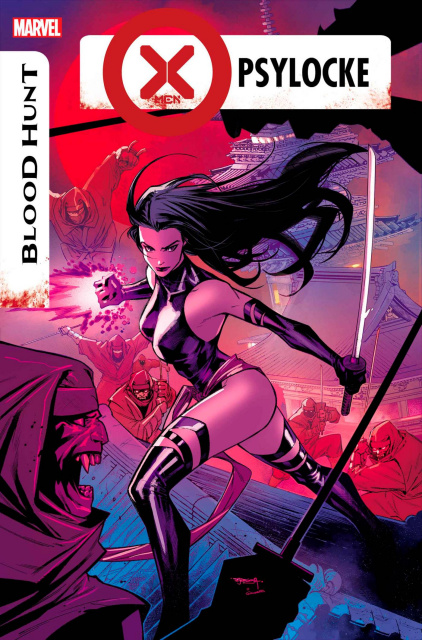
X-Men: Blood Hunt - Psylocke #1

Writer: Steve Foxe, Artist: Lynne Yoshii, Colourist: Ruth Redmond, 
Letterer: Ariana Maher

Psylocke has become a fast favourite X-Man of mine thanks to the way that she was used during the Krakoan Era. Her time on Hellions was fantastic (as was the entire book), and seeing that she was going to be getting her own spotlight issue during Blood Hunt, and that she's be joined by John Greycrow and that she'd be fighting Japanese monsters was just a cherry on top of the cake. The issue begins with the two leads enjoying some down time between X-Men era's, with Kwannon relaxing in a hot spring whilst Greycrow keeps her company, opting to stay out of the water to prevent rust. However, when the sun goes out and the sky goes black and Kwannon begins to sense the death and fear around them, they quickly hit the streets to try and help. However, they find not just vampires waiting for them, but a host of other monsters from Japanese myth, such as the Nure-onna, and the Kuchisake-onna (the Mouth Slit Woman).

Whilst we don't know if this is going to play out into the next X-Era, the fact that Greycrow and Kwannon are still a couple here has me super happy, as I've loved their developing relationship over the last few years; and the fact that this issue discusses Kwannon's fears about abandonment and rejection only to use it to reaffirm their connection was fantastic. It felt like the perfect next step for establishing them as a long running new couple. As someone who loves Japanese horror, I was also delighted that the issue played into that, incorporating some of the monsters from Japan rather than relying on simple vampires. The Slit Mouth Woman was super creepy, and was a great foil for Kwannon in this issue, with her history and her story playing into. The issue also manages to balance the horror, character development, and action really well too, and the leads make for a great duo who we definitely need to see more of in future issues (especially as Greycrow was rocking a pulse rifle from Aliens that we never got to see him actually use).

Lynne Yoshii and Ruth Redmond provide the art, and there are some fantastic moments in this issue. Kwannon and Greycrow look amazing fighting monsters, getting to kill and maim without worrying about being careful or moral questions hanging over what they're doing. They're killing monsters, and it's fantastic. I genuinely loved this issue, and it might be my favourite of the entire event so far. Just like the Magic one-shot, this feels like an ongoing that we need on the shelves. ⭐⭐⭐⭐


Birds of Prey #11 

Writer: Kelly Thompson, Artist: Robbi Rodriguez, Javier Pina, 
Gavin Guidry, Colourist: Jordie Bellaire, Letterer: Clayton Cowles

Birds of Prey is one of those books that I was expecting to like, but never thought I'd love as much as I do. It's very quickly become one of those books that when I realise it's being published that week I get super excited to read it and it makes its way to the top of my pile. The fact that the series was only supposed to be six issues but has gotten to continue on makes it all the better, especially when compared to Green Arrow, which went through a similar extension, yet feels like a book that had to try to figure out a way to carry on, whilst Birds of Prey did so effortlessly. I'm also loving that it's giving us something different to what the title has done in the past, moving away from street level crime to more outlandish adventures.

This issue picks up where the last left off, without team of heroes and their new ally jumping through another pocket dimension portal, rebooting the universe into a new form. This time, rather than dark and gothic, or 1950's glamour, we get dinosaurs and tattered costumes as the team land in a pre-historic jungle, where they have to battle through hordes of giant dinosaurs (much to Big Barda's delight). The issue also manages to progress some of the personal stories somewhat too, with a focus on both Vixen and Sin this issue that gives some big insights into their characters and their emotional states as they deal with the stresses of their situation. 

Whilst the issue includes three artists I honestly didn't really notice whilst reading the book. Part of this might be down to having been so absorbed into the narrative that I just didn't notice, or it could be that the various artists involved had similar styles that it wasn't all that noticeable. However, it could also be down to the colouring of Jordie Bellaire. Colourists often get overlooked when talking about comic art, yet are a huge part of the process, with a book often being make or break depending on the colourist. We've all seen artists we love producing work that looks off because of the colours applied to it. This has never been more apparent to me than this series, in which Bellaire's style changes the art in huge ways. The book looks different to anything else on the shelf because of the colours and the style that it brings to the table, and I can't help but love this series for daring to be so different to everything else. I genuinely love this series, I can't wait to see what weirdness Thompson has in store next time, and I hope the book continues on forever. ⭐⭐⭐⭐


Blood Hunt: Werewolf By Night #1

Writer: Jason Loo, Artist: Adam Gorham, Colourist: Alex Sinclair, Letterer: Joe Sabino

I have to be a little honest, I went into this book expecting something different. I thought that this one-shot was going to be following the other Werewolf By Night, Jack Russell. The one-shot with him in it earlier in the year, by writer Derek Landy, was a great book that I wanted more of, and so I thought that would be what I was going to get here. Instead, we join Jake Gomez instead, as he gets caught up in a magic ritual in an abandoned amusement park that opens up a portal to hell whilst the world is dealing with the Blood Hunt.

Set out in the middle of the desert, in an old dinosaur themed amusement park, the story follows Jake as he heads out to spend the full moon letting his inner monster run around the park blowing off steam. However, he's interrupted when a group of teens and young adults he knew from school come to the park to perform a magic ritual, one that opens a door to hell for the ghost of Duke Jensen to come through into the real world. Not satisfied with just being a ghost, Duke takes over the body of his nephew and begins a reign or terror and death.

I can't help but feel that this could have been a separate one-shot, and may even have started that way, that would have worked better without being tied into the Blood Hunt event. Other than the sky going black as the Dark Force is used by Blade and his people, there's no real connection to the event here. Even the appearance of vampire cops towards the end of the story could have been done without the Blood Hunt connection. The events of this story also happen across the time of Blood Hunt, and the book kind of has to fudge the numbers a little because of that. It says that hours, maybe days go by, and never puts down a firm answer. But the fact that none of the teens running from Duke's spirit are able to escape the amusement park for maybe days does feel like a bit of a stretch. This could have been a fun one-shot issue, but having to tie into the event it's a part of feels like it really hampered a lot of the enjoyment and internal logic for me. ⭐⭐


Star Wars: Inquisitors #1

Writer: Rodney Barnes, Artist: Ramón Rosanas, Colourist:
Guru-eFX, Letterer: Joe Caramagna

The time between the prequels and the original trilogy is an era where we've not had a huge amount of exploration. There is still a lot we don't know, especially towards the start of this time. Yes, we've recently had a focus on this with The Bad Batch, but that didn't give us much, or any, info on the state of the Jedi or the Sith, something that fans are always clamouring for. With this time being the start of the Inquisitors, an order of fallen Jedi turned Darksiders who hunt their former comrades, it seems prime real-estate for exciting stories. The new mini-series, Star Wars: Inquisitors seems to want to make the most of this as we follow the Grand Inquisitor in a mission to hunt down a Jedi survivor who's upsetting the balance of the galaxy.

The first issue sees the Grand Inquisitor being given a special mission by his master, Darth Vader, who has learned of a powerful Jedi Knight names Tensu Run, who has been taking on missions against the Empire, freeing prisoners, and destroying Imperial facilities. Whilst the loss of life and equipment is annoying, the biggest issue is that Tensu Run is inspiring hope in others, and hope cannot be allowed to flourish within the new Empire. As such, the Grand Inquisitor sets out to find the rogue Jedi and end his life. This journey takes him to several worlds, and a huge ship in orbit over a remote planet that houses several Jedi, including Tensu Run's former master.

There are some people who have complained that there are too many Jedi survivors of Order 66, which is ridiculous as even if it was 99% effective there would still be more than 100 Jedi around to play with, which means more survivors turning up in stories isn't too big of an issue for me. Those that feel otherwise will likely dislike this new series, however, as we get several just in this first issue. But, this is what the Inquisitors were made for, and seeing them fight regular people just wouldn't be as fun. Ramón Rosanas has worked on Star Wars titles before, and brings a great style to the title. The characters all look great, and it very much feels like a Star Wars we've seen before, even when we get new stuff. It fits the universe well, and the new characters and locations offer something new whilst still feeling like part of the franchise. For those wanting more Jedi vs Inquisitor stories, and to explore the early days of the Empire this series will definitely scratch that itch for you. ⭐⭐⭐


Batman #150

Writer: Chip Zdarsky, Artist: Denys Cowan, Jorge Jiménez,
Colourist: Tomeu Morey, Letterer: Clayton Cowles

The latest issue of Batman, is a book split across two stories, with only one of them tying into Absolute Power as the cover suggests; so those picking up the title expecting the entire thing to tie into the current event might be somewhat disappointed. However, the section of the book that has nothing to do with Absolute Power turns out to be the best part. The main story of the issue picks up on something that was teased towards the end of an issue way back during Gotham War, an event that a lot of people disliked so might be wondering how that's affecting things now. Way back then, one of the crooks that Catwoman trained up to be a burglar broke into the home of a rich Gothamite and learned something shocking, Bruce Wayne is Batman. Now, Theodore Critchley is trying to sell that information in order to get rich and put his life back together. The only problem is, the criminals either don't want to know, or Batman is following him everywhere.

For the most part, I really liked this story, and this is something that I would actually like to see more of in Batman. We get to see a slightly different point of view on Gotham and its characters through Teddy, and learning about his family life and how it all plays out for him is actually great, especially his son's story. There's a lot in here that feels like the best kind of Batman to me, how he doesn't need to always throw a punch to frighten people, and how behind the scenes he does a lot of good for those that need help. I also loved the Two-Face scene and how he views Batman, and it really sells you on the idea that the big villains wouldn't want to know who he really is.

The back-up story is where Absolute Power comes into play, as we catch up with Batman after the events of Absolute Power issue one. Task Force VII has been unleashed and the heroes have been depowered. Of course, this means nothing for Batman, and so he's still doing his thing; this issue his thing being trying to rescue Cyborg, who would be a huge help to the heroes in this story. We also get a lot of internal monologue of how Bruce is blaming himself for this (totally fair). Weirdly, this issue also introduces the idea that the Amazon Amazo talks with a Victorian era Cockney-like accent; which is frankly a bit bizarre.

The art on the two stories are both really good, and have very different tones to them. Denys Cowan provides the art on the first story, and it gives it a more gritty, dirty, and grounded tone that fits following a henchmen through the mean streets of Gotham City. In comparison, Jorge Jiménez gives the Absolute Power story a bigger feel, it has the tone of a big event tie in, with flashy visuals and a sense of scale that works well in comparison to the previous, more intimate story. Overall, this was a decent issue, but one that was at it strongest when doing something different and not really being a part of the biggest story that Zdarsky has been building since his run began. ⭐⭐⭐


Blood Hunters #3

Writer: Erica Schultz, Josh Trujillo, Sean McKeever, Artist: Bernard Chang, Claire Roe, Lan Medina, Colourist: Romulo Fajardo Jr., Neeraj Menon, Marcelo Maiolo, Letterer: Joe Caramagna,

Blood Hunters has provided readers with tiny snapshots of the vampire take over as we've hopped from story to story, checking in on characters that don't make an appearance in the main title. It's been pretty enjoyable, though the quality of the stories varies from issue to issue depending on your own personal taste. With that being said, this third issue might be my favourite of the bunch, and was one that I really enjoyed. The first issue follows a group of Latverian citizens who are taking sanctuary from the vampires in the walls of their embassy, doing their best to survive whilst hoping that Doom will come to save them. Doctor Doom is a very interesting character, one that I've come to have strong, complex opinions of over recent years, so seeing a villain in a more heroic setting like this, being held up as a saviour, is super interesting. Especially as you're waiting for the other shoe to drop with one of the people waiting for his rescue being a traitor to Latveria.

The second story is where this issue excels, however, with 'The Fall of the House of Udder'. I feel that title alone bags this story as the best in the entirety of Blood Hunt. Speaking of the event, this story has basically nothing to do with it, and is instead a tale of a man who works for Hellcow, taking care of her farm and managing things for the vampire. Yes, it's ridiculous, yes, it's amazing. This is the kind of silliness we need more of from mainstream comics. The final story continues the multi-part 'Once More Into Darkness' that has been in the other issues, continuing to follow Dagger as she tries to find a way to help Cloak, and encounters various other female characters. This issue introduces another character in the final moments, but one that honestly fails to elicit any kind of excitement. This story is definitely the least interesting of the bunch, and I can't help but feel that if we had entirely stand alone stories each issue it would have been more enjoyable. The art across all three stories is great, though the artistic tone in the Hellcow story definitely fits that tale wonderfully, and stands out amongst the others. ⭐⭐⭐⭐


Shazam! #13

Writer: Josie Campbell, Artist: Mike Norton, Colourist: Trish Mulvihill, Letterer: Troy Peteri

There are some problems within the Shazam family at the moment. They have a new home, but can't really settle into it and become a legal family until Bill's issues are sorted out. Billy and the Captain seem to have split somewhat and aren't getting on. And the siblings who lost their powers have been a bit envious that Billy and Mary get to keep being super heroes. There are more, but these are the main points that are driving the current arc, as Mary and Freddy hit the road to try and find the Rock of Eternity and their missing brother, Billy. Whilst searching for their wayward brother the two of them come under attack from some monsters, which sees Freddy jumping into the action despite having no powers; a decision that leads him to an old villain, and a potential new path.

Josie Campbell clearly loves the Shazam family and their lore, and is not only bringing in small threads left hanging in the Waid run, but her previous New Champion of Shazam! mini-series, and older comics too. The book feels like a great mixture of classic Captain Marvel adventures, with the reintroduction of Uncle Marvel in a new role that's nonetheless delightful to see, with some brand new ideas. The story also seems to be taking Freddy in a new direction that could add some great new drama to things. He looks poised to be gaining new powers, probably from a less than reputable source, and whilst this feels like a bad idea it also feels very in keeping with where his character is at at the moment. He misses being a hero, he's jealous of his siblings even if he'll never admit that, so of course this can be taken advantage of. In a lot of ways the Shazam book feels like it's taking place in its own little corner of DC, doing things different and just having some fun; and because of that it's the kind of series anyone can pick up and have a blast with. ⭐⭐⭐⭐


Support Amy on Patreon

Buy Amy A Coffee

Go to Amy's Blog